Screenshot Comparions

I can’t decide which is better so I figured I’d put them side by side. If you feel like offering your opinion, feel free :3 And you can say you like new for some and old for others–it doesn’t have to be all just one! Gannifari is not listed due to the fact that I don’t actually have one so it’s just an official photo right now…

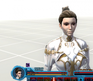
Oh, and some random pictures of Marilea in her pretty outfit just for references I suppose:


(And I even updated her on Mr. Robot. Wish List is what I’m aiming for so all help is appreciated)

Anyway, I shall put it under a Read More due to being a little Picture-heavy.

Old ScreenshotNew Screenshot

2 thoughts on “Screenshot Comparions

  1. I’d say the organic ones (except, perhaps, for the Orobirds) look much better, and clearer, in the new screen shots. The mechanical ones seem more of a mixed bag, though. While the new shots make some a good bit clearer (Little Sandcrawler, for example) the lighting seems to be causing some weird effects in the textures and occasionally too much reflection (The Czerka Eye).


  2. Pingback: Poll time. | Pink Lightsabers

Leave a Reply

Your email address will not be published. Required fields are marked *

This site uses Akismet to reduce spam. Learn how your comment data is processed.